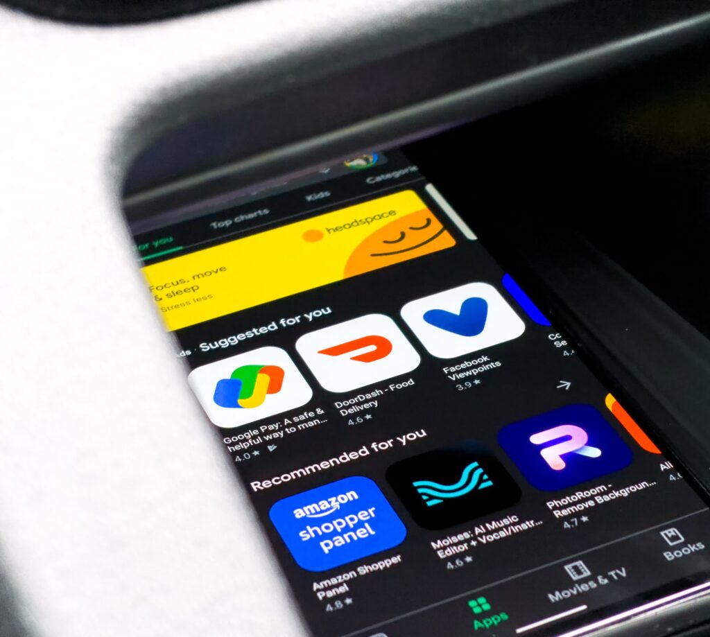
In today’s digital landscape, an app icon serves as the first point of interaction between your app and potential users. It’s the visual embodiment of your app’s identity, encapsulating its essence at a glance. With millions of apps vying for attention on major platforms, having a distinctive and memorable icon can significantly influence the success of your application.
In this comprehensive guide, we delve into the significance of an app icon and how it can make or break your app’s first impression. We will explore the psychological impact of color, shape, and design, providing you with actionable insights and best practices.
Join us as we embark on this journey, starting with a deep dive into the pivotal role of an app icon in the digital marketplace, followed by expert tips and techniques to help you design an icon that truly stands out from the crowd.
Why is the app icon so important?
The quality of your app icon affects your app’s rank and visibility, which is why creating a great icon should be included in your App Store Optimization strategies.
Here’s what an attention-grabbing icon can do for your app:
- Help your app stand out in the crowd of apps competing for attention.
- Give users a great first impression of your app.
- Provide users with clues that indicate what your app can do for them.
- Make users curious enough to look more closely at your app and learn all about it.
Ultimately, a well-designed app icon can increase user acquisition.

Tips for how to create icons
Crafting an app icon requires a meticulous approach to ensure the end result not only captivates but also engages your target audience effectively. To navigate this creative endeavor successfully, consider the following guidelines which are instrumental in creating a visually appealing masterpiece that draws users to your app.
Embrace simplicity
Due to the limited real estate of an app icon, integrating text into your design can render it cluttered and challenging to decipher, particularly on smaller screens. Icons thrive on visual simplicity and immediate recognition, qualities that text can sometimes compromise. Therefore, it’s advisable to steer clear of incorporating words into your icon, allowing its imagery to communicate your app’s essence directly.
When text becomes necessary
There are instances, however, where text is integral to conveying the app’s purpose or identity, especially if your brand’s recognition is closely tied to its name or initials. In such scenarios, clarity becomes paramount. Any textual element included in your icon design should be legible at a glance, ensuring that users can easily identify and understand it without straining. Opt for fonts that are bold and simple, with sufficient contrast against the background to stand out effectively.
This nuanced approach to text usage in app icons underscores the balance between aesthetic appeal and functional clarity. By prioritizing simplicity and legibility, you can craft an app icon that not only captures the essence of your app but also resonates with your intended audience, encouraging them to explore further.
Pick the right colors
Selecting the optimal color palette for your app icon is a strategic decision that can significantly impact its visibility and user attraction. Color not only defines your brand but also influences user perception and emotions, making it a crucial element in the design process. Here’s a refined approach to color selection for your app icon:
Leverage brand identity
Firstly, prioritize your established brand colors when designing your app icon. These colors are a direct reflection of your brand’s identity and values, fostering instant recognition among your existing user base. Consistency in color usage strengthens brand recall, enabling your app to be easily identified amidst a sea of competitors on a crowded platform.
Seek inspiration with purpose
While it’s beneficial to analyze the color schemes of similar apps for inspiration, the goal is not to blend in but to stand out. Observing your competitors’ choices helps you understand industry trends and user expectations; however, the real opportunity lies in differentiating your app.

Simple is better
Embracing simplicity in your app icon design is more than a stylistic choice. The limited canvas of an app icon means that every detail must be deliberate and meaningful. Overcomplicating the design with excessive elements can lead to a cluttered appearance that detracts from its appeal and effectiveness.
The art of crafting an app icon lies in striking the perfect balance between simplicity and distinctiveness. A minimalist approach not only ensures that your icon remains legible across various devices and resolutions but also allows its unique features to stand out more prominently. This doesn’t mean your icon should be dull or generic. On the contrary, the challenge is to distill the essence of your app into a simple yet captivating visual that immediately grabs attention and communicates purpose.
Achieving this delicate balance requires careful consideration and creativity. By focusing on core elements that reflect your app’s identity and function, you can design an icon that is both effortlessly simple and irresistibly engaging, ensuring it resonates with users at first glance.
Change the app icon from time to time
Refreshing your app icon periodically is a strategic approach to maintain user engagement and ensure your app stays relevant amidst the dynamic landscape of app stores. Seasonal updates or thematic variations can breathe new life into your app, making it more appealing to both existing users and potential new downloads. Here’s how to effectively implement this strategy:
Seasonal updates
Incorporating holiday-inspired modifications or seasonal elements into your app icon can create a sense of novelty and excitement among your user base. For instance, introducing festive details or colors during Christmas or other significant holidays can not only capture the essence of the season but also attract users’ attention as they navigate through app stores in search of holiday-themed applications or updates.
Balance novelty with familiarity
While updating your app icon, it’s crucial to strike a balance between introducing new elements and maintaining recognizable aspects of your original design. This ensures that while your app stands out with its refreshed look, it remains identifiable to your existing users. The key is subtle transformation—adjusting your icon to reflect the festive spirit or seasonal changes without losing the core identity that users associate with your app.
This approach not only enhances the visual appeal of your app but also demonstrates your brand’s dynamism and responsiveness to cultural and seasonal trends. By thoughtfully updating your app icon to align with different times of the year, you can keep your user base engaged and intrigued, encouraging them to revisit your app and explore new features or content.
Keep the size requirements in mind
An Android icon has different size requirements than an App Store icon. You must keep this in mind when creating your design so that you can minimize the variations between the two icons.
Your Android icon and App Store icon might still be slightly different from each other, but the overall design should be very similar.
Follow these manuals to ensure your icon design looks great on both stores:
Test your app icon
Refining your app icon through A/B testing is a critical step in optimizing its appeal and effectiveness. This methodical approach allows you to compare different designs and identify which elements resonate most with your target audience. Here’s how to approach A/B testing for your app icon with precision and purpose:
Implement focused testing
Begin by isolating specific elements of your icon for testing, such as color schemes, imagery, or shapes. This focused approach enables you to understand the impact of individual changes on user engagement and preference. By altering one aspect at a time, you can gather clear insights into what adjustments enhance the icon’s attractiveness and click-through rate.
Iterate based on data
Use the feedback and data obtained from each A/B test to iteratively refine your app icon. This process is not about random changes but informed decisions that gradually lead to a design optimized for visibility, recognition, and conversion. Whether it’s tweaking the color palette, simplifying the imagery, or experimenting with different backgrounds, each modification should be driven by the test results.
Achieve icon excellence
The goal of A/B testing is to sculpt your app icon into a form that not only stands out in the app stores but also encapsulates the essence of your app, encouraging more downloads and engagement. This iterative testing and enhancement process is fundamental in navigating the competitive app ecosystem successfully.
Mastering the art of icon creation is crucial for any app looking to gain prominence and attract new users. By adhering to the guidelines shared in this article and employing A/B testing to refine your design, you are well on your way to developing an exceptional app icon that meets your strategic goals. This focused and data-driven approach to icon design will ensure your app not only captures attention but also sustains interest and grows its user base.
Conclusion
the journey to crafting an app icon that resonates with audiences and stands out in a crowded digital landscape is both an art and a science. By embracing simplicity, choosing the right colors, refreshing your icon to reflect seasonal trends, and employing A/B testing, you equip yourself with a strategic toolkit to create an icon that captivates and engages.
Remember, your app icon is not just a visual mark; it’s the gateway to the unique experience your app offers. It sets the stage for user engagement and plays a crucial role in the success of your digital offering. With the right approach, your app icon can become a powerful beacon, drawing users to explore all that your app has to offer.
For those looking to take their app’s visibility and user engagement to the next level, we can help you refine your app icon and overall branding to ensure you make a lasting impression in the app marketplace. Contact us today to learn how our tailored solutions can elevate your app’s success.

